This is the first thing I tried, on a plain carapace:
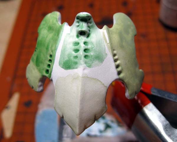
I tried five different things on this piece:
Right side is two thinned coats of RMS Pale Olive applied with my standard size 0 brush. I'm not a fan of this one, as applying it with the small brush seems to both take forever and cover poorly. You don't do big, flat areas with a tiny brush.
Top center is a straight wash of Thraka Green over the white primer. I wanted to see what it looked like. Meh.
Bottom center is a super thinned coat of Pale Olive applied with a size 2 brush. I actually liked the effect here, but don't feel it's sustainable or visually interesting. It looks a lot like watercolor.
Left bottom is another double coat of Pale Olive, again applied with the size 0 brush. I then put the Thraka Green wash over top of it on the left top. Looks like crap.
Next up:
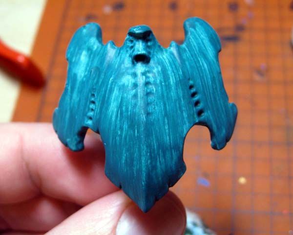
This is another smooth carapace that I painted with RMS Forest Green. I tried not thinning the paint a all, and simply applied it with a moistened (not soaked) size 2 brush. I put a quick coat on that covered poorly, and then picked up my desk a little. I went back to the carapace about 5 minutes later and tried another coat. The brush pulled off some of the prior coat and pushed it around. I used that and started pulling the paint in streaks back to the bottom points.
It's a neat effect, but it's not a skilled application of paint. I could probably use it as a base for something, but I think it would just end up looking a mess when I was done.
Finally:
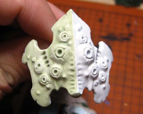
This is a slightly thinned wash of Pale Olive applied with the size 2 brush on the spore cyst carapace. I actually like this effect quite a lot. It's got nice contrast, and the pale effect I was going for. The problem again is that it just looks like watercolor, not a skilled application of paint.
I sat and thought about these samples as I tried to drum up an 1850 Nid list for the third annual Standish Standoff in November (which is hard to do).
I think the problem I'm running into is that I'm trying to achieve too much with a single color of paint and washes. Looking back at some of the Tyranid armies I've admired online, the painters don't go straight from their primer to their base color/shading. They apply a SOLID coat of the core color, then wash down, highlight back up. I was using the white primer as a shortcut to get the palest color I could, instead of mixing proper shades. The Cult of White Primer is a whole new religion for me after six years of being a Black Primer Cultist.
I also think I'm starting with the wrong bits to practice on. Big, flat plates are simple work, and don't lend themselves to any real technique. I have some thing I will ultimately try out on them, but right now I should be working on the non-plated parts of Tyranids. I think the trap I fell into was attempting to get that mottled crab look on every piece of a model. It's just not going to work for two reasons: it doesn't carry well to a painted medium, and Nids are not crabs and they do not share a complete anatomy.
If every single part of a Tyranid was plated like a crab, I could see the blends and mottling working. I could simply mimic the blends on the appropriate body parts and be done. However, Nids have some very non-crustacean features, especially their limbs. This means I have to think up a more organic paint job for them. Attempting to smoothly blend each segment of a bio weapon or scything talon would look crappy, and make me insane.
I need to refine my color scheme to something more traditionally Tyranid. I need a single palette for the body sections, another for armor plates, and a third for all the little detail parts like the exposed musculature you see on a lot of parts. There's a batch of new paint colors on its way to me from Reaper right now. I put the order in the other day. Once that arrives and I test out the new colors, I can decide on my final color palettes. Until then, I will have to get out some of the many spare arms and bio weapons I have in my new bits collection and start priming a few. I'm considering switching to a spray can primer, as I simply do not have the time to sit down and airbrush prime so many Nid parts. I'm commuting or at work from 7am to 5:30pm every day, and the boy is in bed by 6:30. No time to spray on a weeknight, ever.
Any tips, suggestions, or feedback on the above samples or my musings today?
The streaked effect looks traditionally Tyranid to me. With a wash and highlight to bring out the contours it could be a very effective way to go.
ReplyDeleteI like the thin green the best. You've achieved a nice, smooth application in an interesting color that already accentuates the contours of the shell. The skill with this type of effect is that you have to get it in one step. On that piece it will be difficult to go back and match the other half to the first without a line where the two applications meet. It will also be very difficult to correct mistakes.
You can play with the transparency of this application to get some interesting effects as well. You could add mottling or other patterns by layering the same color. Or you could add some patterns in another color then put this coat over it to blend them together more smoothly.
The streaked effect is definitely cool, but I think this one-color version looks better in the picture than it does in real life. I can build off of it, so we'll see.
DeleteI think thehardest part about the thin green is indeed consistency. It will be very tough to get the green to match across the different pieces of the model, let alone different models. Of course, not every creature in a swarm will be the exact same tone.
I know that I am leaning toward a pink/red gradient on the edges of the arm and leg sections. I've seen a few pictures where it happens on crabs, but am not sure how it will translate to a mini. I'm also considering switching from green to a croal color instead.
So many choices!
I feel as if you are going about this wrong. At the end of the day, you paint for you. Look at Picasso or Jackson Polluck. These are people that painted in very unique styles that, in part, became part of "advanced art". But they didn't say "is this advanced art"? They did what they liked, they did what they felt felt right. I say do the same thing. In the words of Donald Trump "Do what you enjoy and success will follow". In translation, figure out HOW to achieve the LOOK you want, not how to maximize advanced methods. Then, once you have gathered your forces and have figured out the look, apply the best techniques to achieve that and incorporate the complex techniques into the look. It just seems you are focused too much on complexity and may pigeonhole yourself into a look you don't like as much by virtue of discarding the best option as it may not be complex enough.
ReplyDeleteOther than that, the streaked look looks very "insectish". Insects have camouflage that tends to be streaky while crustacean camo tends to me more mottled. Perhaps utilize some more stippling.
I agree 100% with Willy. To be blunt, fuck if it's "a skilled application of paint," and do something that works. If it looks great then that's all the matters, not the application. Hell, I've seen dry brushing on an entire model that looks amazing. Only painting snobs give a shit about technique.
DeleteAs for your testing, I also like that last one with pale olive. You could tone it down with washes easy enough if you think it's too pale. Personally, I think the paleness works. It makes me think of something faded out and weathered, which I feel works with Nids.
Yeah, I was a little caught up in the spectacle of the thing, and didn't think enough about the end product.
DeleteThe big thing I'm struggling with right now is an overall paint scheme. I had my heart set on the green crab colors, but am now rethinking it. These test pieces don't illustrate well enough ow the entire model will look. I've pushed up a Genestealer in my priority chart, because I feel it's more important to get an overall scheme down early. I need to see how the skin colors stack up against the shell colors.
I definitely find it's easier to get the entire model completed before making a judgement. Even if it's just a fast paint job for the sake of seeing the colors together.
Delete