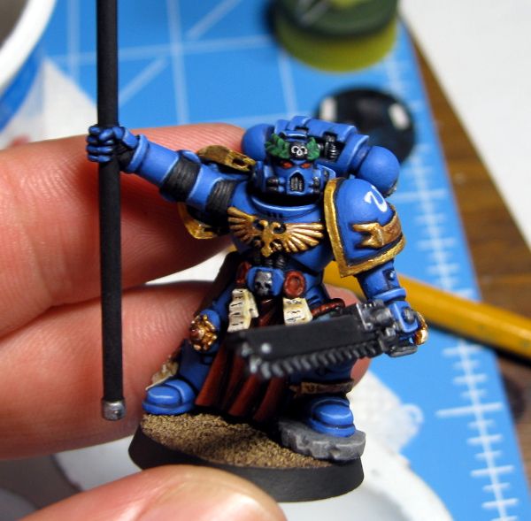
The Marine himself is pretty much done, with only some static grass needed around the edges of the rock he's standing upon. That rock was actually a major pain in the ass to base around. Normally, I put small strips of plasticard under my Marines' feet. This raises them up a tiny bit so they don't appear to be sinking into the ground. It also allows me to put sand all the way under their feet, so I don't end up with gaps around the feet when I glue the model to the base. The problem with the rock was that I wanted it to look like it was sticking up out of the sand, not sitting on top of it. I skipped putting card under it, while still putting card under the other foot. I'd hoped it would allow the rock to be sunk down while the other foot was not. All I ended up with were the gaps. It's simple enough to obscure them with static grass, but I need to be careful not to apply too much and make it look like a fuzzy ring around the rock.
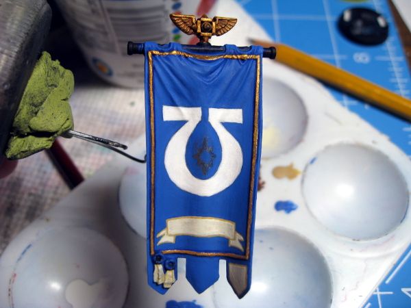
Here is the current state of the banner itself:
It's pretty plain. Originally, I'd had grand plans for it, with a huge laurel wreath surrounding an Imperial aquila clutching the Ultramarines symbol in its talons, with the scroll at the bottom. I sketched it out on paper and searched Google for art I could use as a model to construct the whole thing. I was then going to print it out to scale and use the pencil-rub/carbon paper technique to transfer it to the banner. Then it would be a simple matter of painting it. Problem is, I no longer have access to Photoshop and GIMP flat out sucks for working with images other than retouching and cropping things. Every time I tried to combine my images, one would end up pixelated beyond recognition, or the scales wouldn't match, etc.
I said "screw it" and sketched a new design on the banner with a soft, sharp pencil. I had wanted to sketch my original design on there, but the curves of the piece make intricate lines tough. I ended up just going with the simple design you see above. That grey smear in the middle will be a red starburst that I need to re-draw and re-center. The red starburst is an old-school Space Marine symbol. It's supposed to be used for veteran sergeants, but I've co-opted it as a more generic symbol.
I still need to go back in and add some shading to the scroll and the symbol. Probably just a thin layer of a darker color for each one, and I should probably ding up the edges of the scroll with tears and dog ears. You don't typically see perfect, pristine scrolls on 40K artwork.
I also need to add something to the area between the Chapter symbol and the scroll, especially to the right and left edges. I'm not sure what to add though. A fancy, squiggly design? A couple crux terminatus symbols? Very small laurels?
There's no way I'm adding anything above the Chapter symbol unless I get VERY brave and ambitious. Those folds are a nightmare to draw on. If I were to add anything up there, it would likely be a row of checkered boxes, a Greek key design, or a small aquila.
We've also got the monthly tourney at the FLGS tomorrow. As of right this moment, I'm planning on going. I just have no idea what I'll bring for an army. I've not played at the FLGS in months now, so I have no real idea of what the meta is anymore. From what I've seen on Facebook and blog posts, there are plenty of Knights showing up in Imperial forces. Still a good number of power armored players, and plenty of monstrous creatures in non-Imperial armies. I guess it doesn't really matter, as honestly I've not upgraded my army to a 7th Edition style. There isn't a single grav weapon on any model in my collection yet. The last time I had plans to upgrade my bikes, it was to add Scout Bikers and a Command Squad with power lances. That should tell you how far behind the times my army is now.


He's looking great.
ReplyDeleteFor the banner I might do one long laurel that curls up at the ends.
Thanks.
DeleteDo you think a similar effect would look good with ivy instead of a laurel? Basically, just fewer leaves.
That would work too. I just think whatever you add should be one piece that goes the width instead of two smaller items on each side.
Delete