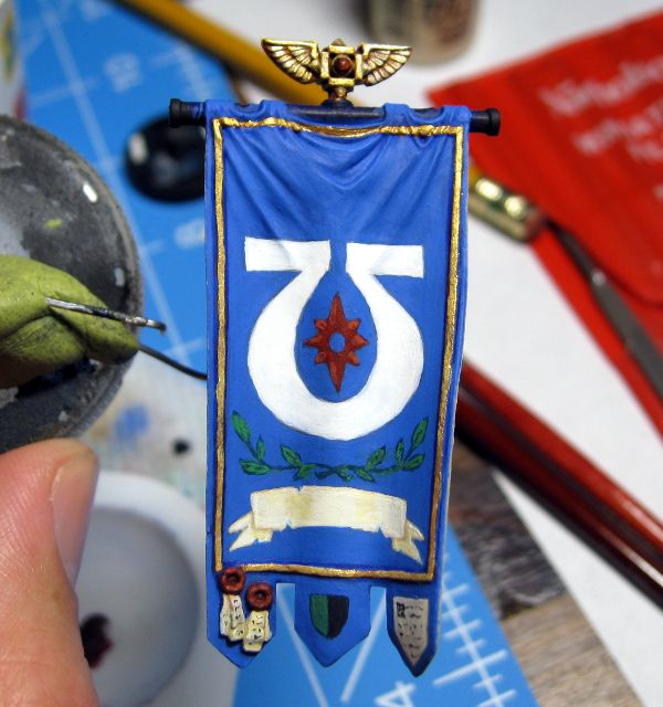
I added some shading to the scroll, and knocked off all of the dark edge lines I'd had on it before. I then added the red starburst, and some small highlights on each point. However, I need to go back and clean those lighter areas up some. Some are a little blobby. I added black line text to the purity seals and the bottom right design, and put a campaign badge on the bottom center...thing. I'm not a huge fan of the badge though, and it may end up being removed. It's off center and pretty plain.
I also added the ivy/laurel branches. I started by sketching the branches out with a sharp pencil, then went over them with dark green. After that was dry, I added the leaves in the same dark green, let them dry, and then applied a thin lighter green on top. Unfortunately, by that point I was getting a little tired and slipped in some places and was messy in others. I added small lines of dark green to the leaf centers and called it a night. I need to go back and tidy up the leaves.
Once the leaves are done and I've decided on what to do with the center bottom design (it's bugging me that I don't know the term for those little things on the bottom of the standard, I'll have to Google after this), I'll finish the back in an ivory or linen color. I think it'll look nice that way and break up the sea of blue. I'm about halfway done that process, but it's pretty boring so I didn't take a picture.
I'll be happy to have this model finished, but I do have to say that I really enjoy painting the freehand on the banner. I've always been a glutton for punishment.
As soon as this is done, I can move on to the tank hunter veteran. He'll be an easy one, and then I'll get my bionic veteran up and going. Again, an easier paint job (aside from his head/face) but I'll also have a review of the Kromlech legs I ended up buying for him.
That laurel really pulls the top and bottom together nicely. Good job. The addition of the starburst helps the balance things out as well.
ReplyDeleteI think your shield looks good, and also lends balance, but you just need to change that green, it just blends in too much.
Thanks. I am thinking of replacing the green with white for a simpler effect.
Delete