Let's look at some of my past Space Marine Bikes as examples, and then compare them to my most recent work.
Here's my Biker Apothecary:

He's "ok, not great." He uses my old gold painting method, which was very flat, and some subdued edge highlights. The white is ok, and I'm sort of proud of the fact that the liquid levels in the narthecium match the gravity of the model. The purity seals lack depth in the red. Keep an eye on that box magazine for the bolters, as well...
Here's the first biker I ever painted:

Again, gold is super flat, highlights are thin and pale. The metals are dirty and lack any sort of depth.
My biker Captain model:
More of the same problems. That tarp on the back is just terrible. The bolters on his bike aren't even squared to the front. They point downward!
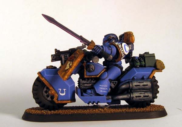
Finally, my first Attack Bike:

Same as the other bikes, but look closely at the tire on the sidecar. Nice mold line, man! Sheesh!
Now compare those to my recent Attack Bike:
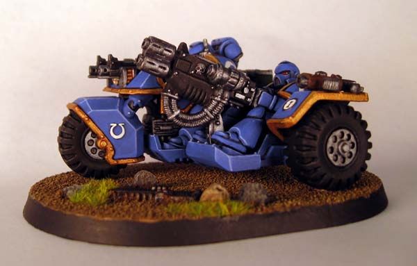
Highlights are brighter and more crisp, the gold has actual levels and depth, as do the metal parts. Remember the box magazine? I actually painted the exposed rounds! Go back and look at all the older bikes. Does the contrast of the loaded brass look better or worse than the all-silver box mags?
I don't have a photo to help illustrate this one, but on the recent attack bike I painted all of the console and handlebar buttons one color, red. I attempted some lens effects on them, and they look pretty good. On all my old bikes, I painted each set of buttons a different color. Yellow, green, red, blue. The consoles look like a Christmas tree. No lens effects, just flat paint. When I first painted those old bikes, I figured the Marines would want different colors for what each button does. The effect is just too busy. It doesn't provide contrast or crispness, it creates visual confusion. Besides, Marines are psycho-indoctrinated and battle hardened. They don't need multicolored buttons!
I'm rapidly learning to take my time and examine the small details of my models, like exposed brass casings in a magazine or the purpose of using colors on different objects. I'd have to say it improves the end result quite a bit. Would you agree? Do you have any small details you always make sure to paint? Any favorite little bits to touch with paint?
No comments:
Post a Comment